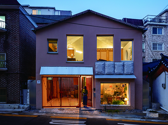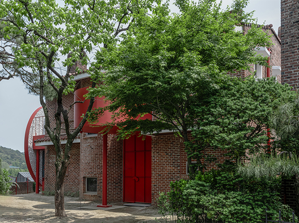
top image Residence for Mr. P (2025) by KHYarchitects. ©Park Youngtae
SPACE August 2025 (No. 693)
If you find yourself drawn at first glance to the works of aoa architects (principal, Suh Jaewon) and KHYarchitects (principal, Kim Hyoyoung), it is likely a response to the distinctiveness of their forms. What’s cute draws you in, what’s intriguing makes you stop, and what’s unfamiliar gives you pause.▼1 These forms may appear trivial at first, yet they possess a clear and persuasive power, so much so that many are pulled into the stories that lie within; stories in form. In their own ways, both architects are speaking about the roles and methodologies of architecture. Let’s take a look inside their recently completed works, The Petit House, Cheongun (2024) and Residence for Mr. P (2025).
The Petit House, Cheongun (2024) by aoa architects
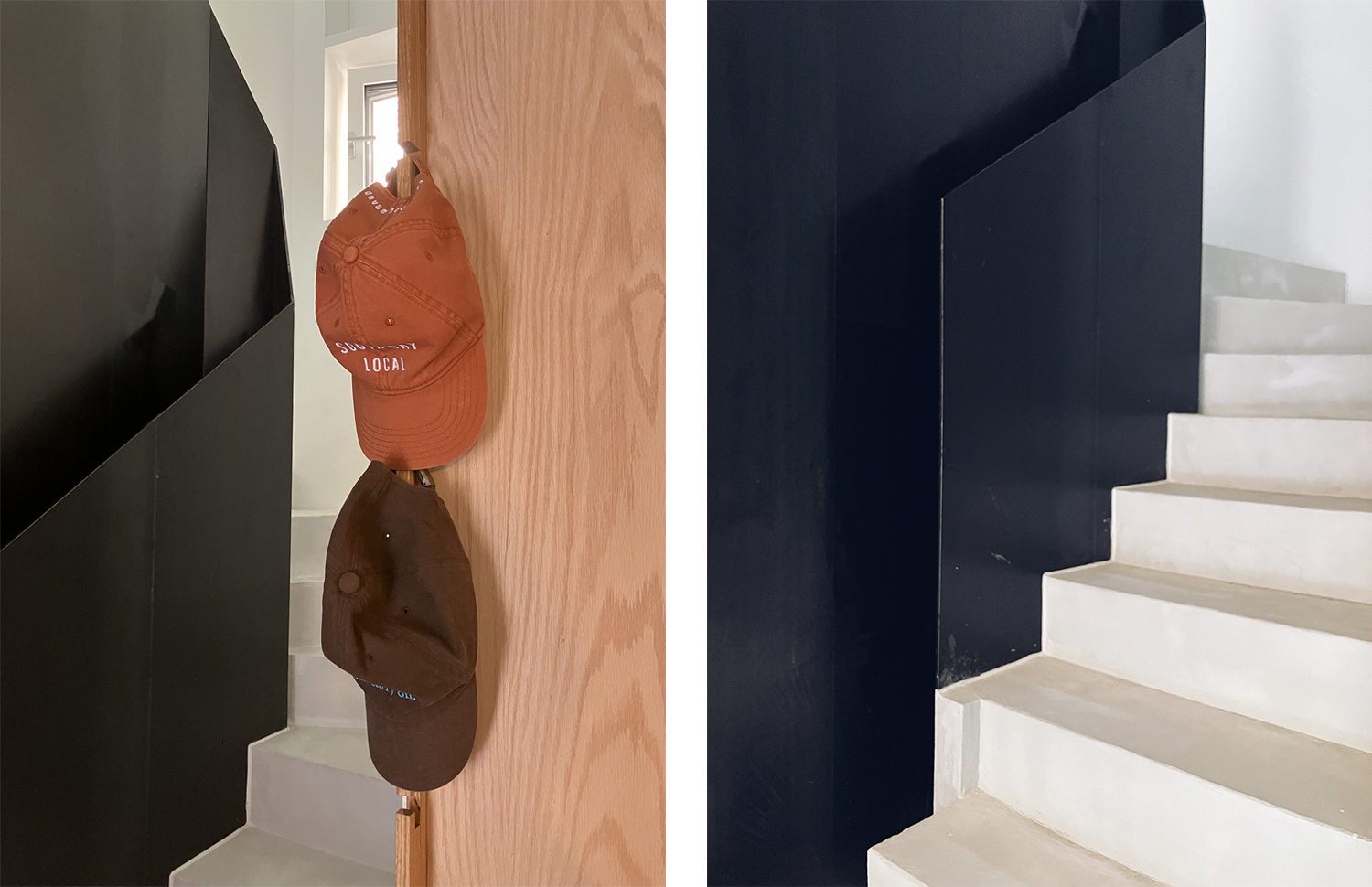
Design embracing construction errors: hat hook (left), strange square (right). ©Suh Jaewon
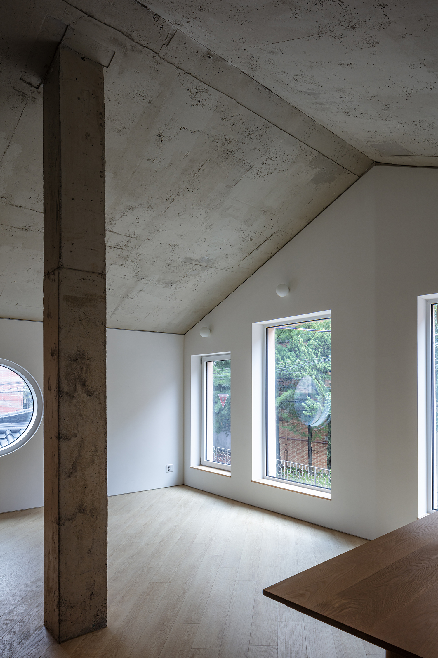
The Petit House, Cheongun (2024) by aoa architects
Park Jiyoun (Park): Recently, aoa architects and KHYarchitects each completed a residential project in Cheongun-dong. While they are different in terms of the scale and one is new construction and the other is renovation project, they seem to share the same residential purpose, providing a basic common ground for comparison. Now marks a timely opportunity to more closely examine the similarities and differences between the two architects, who are often grouped together.
Listening to Architecture
Suh Jaewon (Suh): Both Kim Hyoyoung and I use geometry and colour. While I lean more towards a certain formality and use less aggressive colours, Kim seems to pursue form more actively and employs more attentiongrabbing colours. My use of colour tends to be intrinsic, while Kim’s is extrinsic. For example, I finished The Petit House, Cheongun with the light pink stucco to blend in with the surrounding red-brick buildings, not to stand out.
Kim Hyoyoung (Kim): The architectural concerns we raise and the vocabulary we employ in response are quite similar, which is why our works may appear alike at first glance, unless examined closely. We both adopt references in our design process, but I believe there is a difference in methodology. I speak with the intention of communicating with the public—of creating points of contact between architecture and society. In contrast, Suh places greater emphasis on internal discourse, voicing critical reflections from within the architectural field itself.
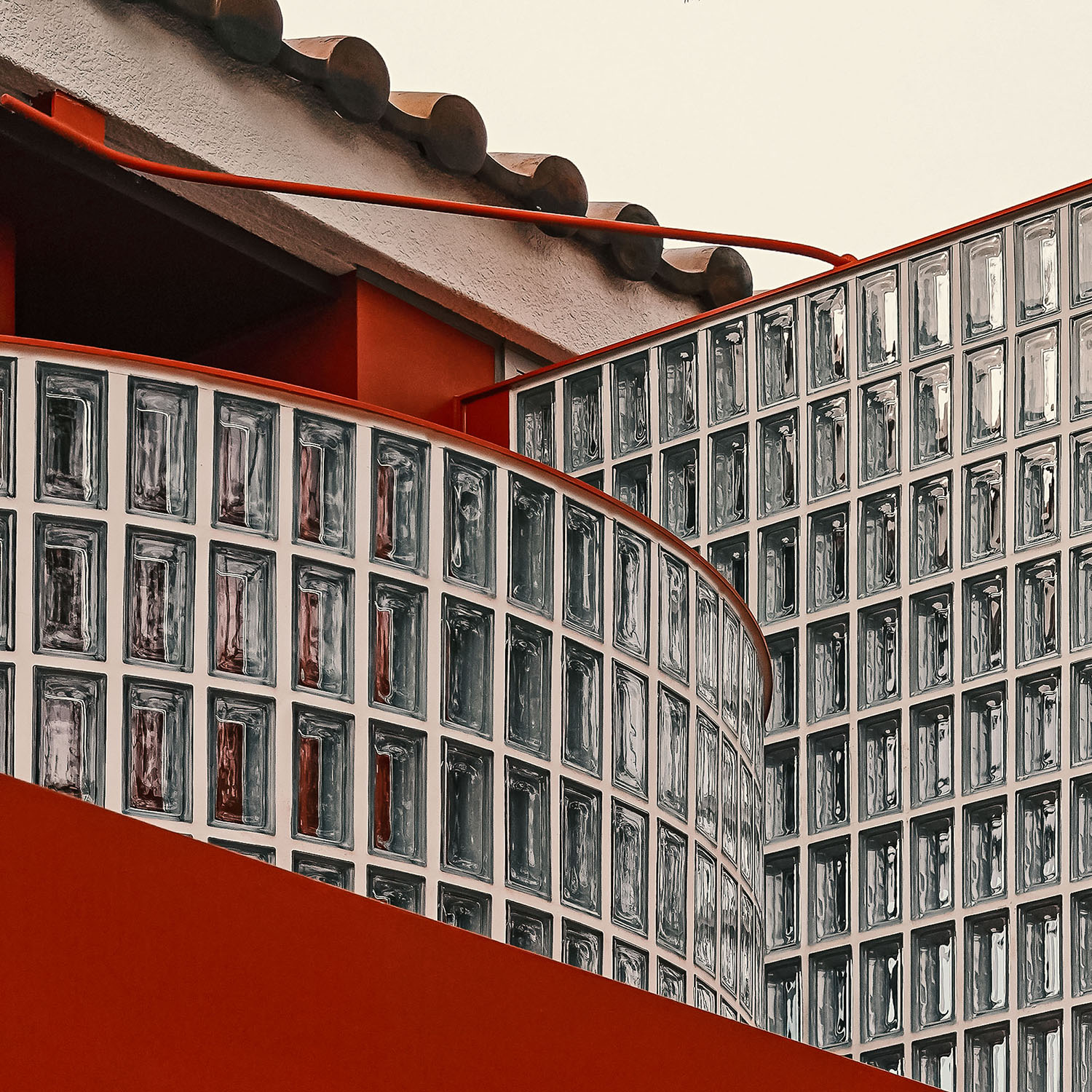
Park: In The Petit House, Cheongun, the enlarged frosted finish on the façade, and in the Residence for Mr. P, the large, rounded moon jar element, clearly represent the methodological differences in the handling of the form. The frosted finish is a statement to the architectural community—an appeal to engage with those architectural elements rooted in this land, rather than those imported from the West. The moon jar, on the other hand, is an exaggerated response to the client’s request to block views from the neighbouring house. By amplifying function, it draws attention to the architecture itself.
Suh: Passersby likely don’t even recognise the frosted finish for what it is, and they probably don’t find its larger-than-usual scale particularly strange either. Those who do find it odd are probably architects.
Kim: But doesn’t it stand out for members of the general public as well? The square steel tubes used to support the corrugated steel panels are fully exposed on the elevation. Ordinary viewers might find this lack of finish rough, but, at the same time, they may also find it strikingly unique.
Suh: Exposing the supporter of the corrugated metal panel on the façade is a reference to old vernacular houses where polycarbonate panels were layered beneath tiled roofs. Also, because it’s in Seochon, the surrounding context prevents it from feeling unfamiliar to the public.
Park: When viewed in isolation, each individual element might stand out, but seen from the street as a whole, the impression was rather charming. In contrast, Kim’s large, rounded moon jar form is unmistakably eye-catching, and deliberately so. Why does he believe the public should pay attention to his work? What is the intention behind it?
Kim: I see the lack of connection between architecture’s internal discourse and its communication with the outside world as a fundamental problem, particularly as I reflect on how architecture can establish points of contact with society. In the process of designing and building, I seek out narratives that can be shared with the public and present them as if shouting. This emerges from a determination to engage in dialogue by any means necessary. In Jeomchon Gi-wa House (2018), I aimed to reveal the friction between the traditional tiled roof – representing a cultural preference in architecture – and a functional floor plan that doesn’t align with it. In Apgujeong Neighbourhood Living Facility (2020, covered in SPACE No. 655), I sought to give direct form to the materialistic desires that define the Apgujeong neighbourhood. The large circular moon jar in Residence for Mr. P was originally a response to the client’s request to block views, but given its prominent position atop a retaining wall, it also became a symbolic tribute to the client’s mother, a moon jar artist, and a monument to the client’s return. In any case, form is not the goal, but a vehicle for expressing content. What matters is not whether something stands out, but what it seeks to reveal and communicate, and whether that expression is appropriate to the content.
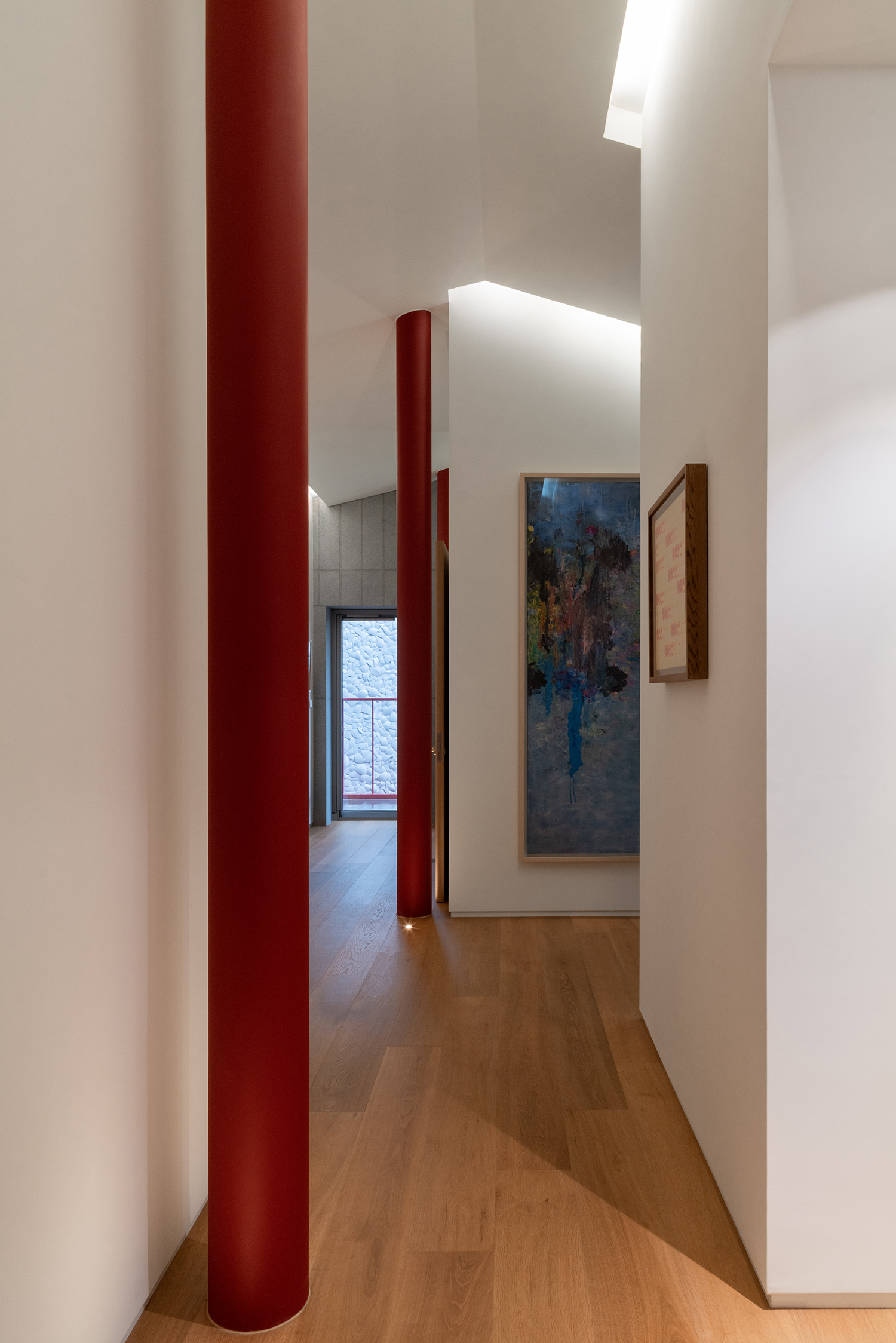
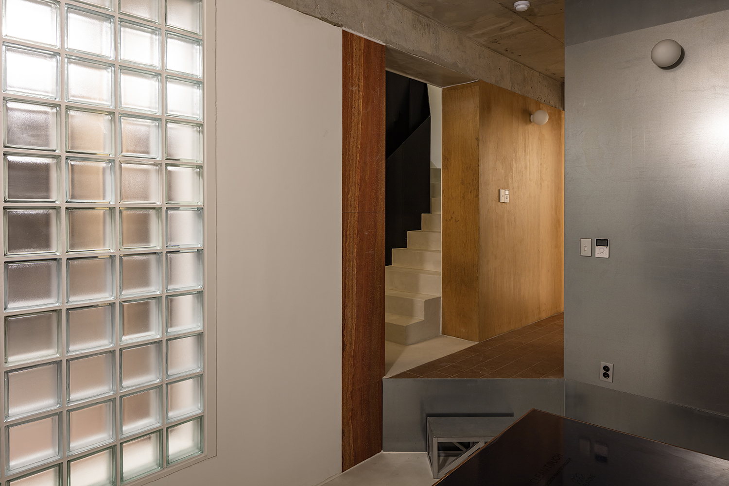
Residence for Mr. P (2025) by KHYarchitects
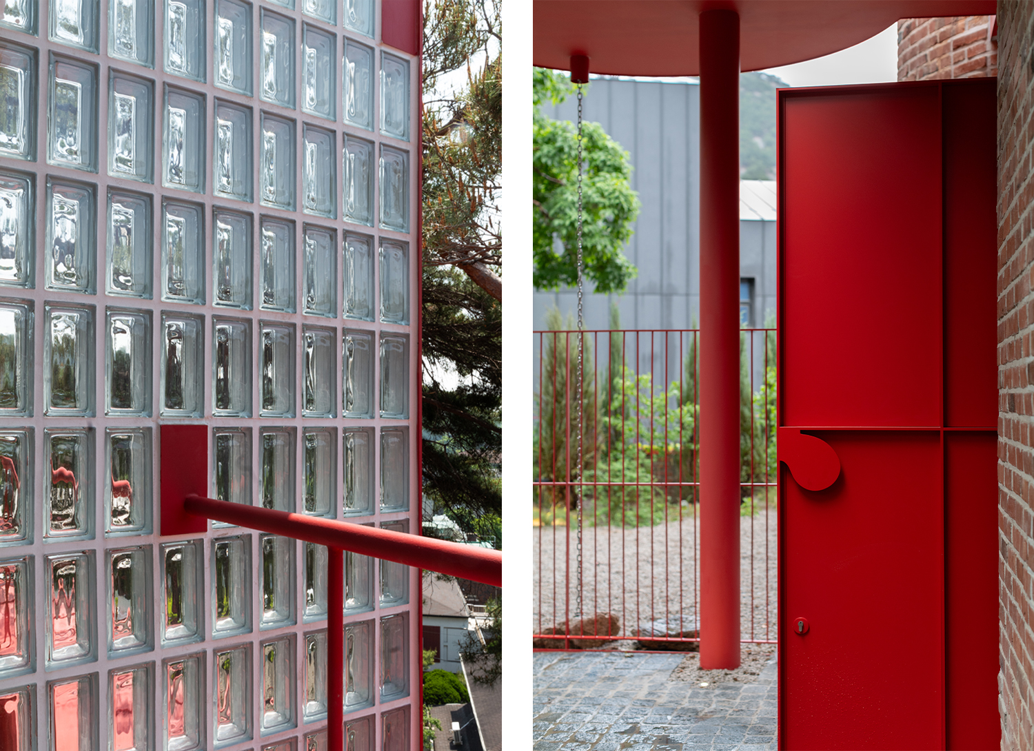
Residence for Mr. P (2025) by KHYarchitects
Substance and Elements over Form
Suh: Another similarity between us is that
we’re both formalists. We begin with a geometric composition and then layer in
other elements. That said, I think Kim’s project is significant in that it
proposes a different type of ‘wellto- do’ house. Typically, wealthy homes tend
to share certain expectations— expensive door handles, imported marble, and
concealed details aimed at achieving a sleek, clean finish. While this project
doesn’t entirely break away from those conventions, the bold use of red paint
on the main façade creates a degree of separation from the archetype that tends
to revere materiality almost religiously. Although – I must say – even the
molding was painted red. (laugh) I did wonder whether that was really
necessary. Of course, red molding isn’t particularly difficult to produce and
doesn’t involve any artisanal technique, but when viewed from all angles, the
space feels visually ungrounded.
Kim: Since it was a house renovation, there
was no room to reconfigure the external form. Working at a relatively small
scale led me to focus more on the details, and I wanted to bring a kind of
craft-like quality to the metal elements. Also, considering that the original
exterior was made of red brick, I set a principle to use a consistent red tone
on the metal, one that wouldn’t be overly conspicuous.
Suh: Conceptually, I understand the
intention, but had only the canopy or the column at the entrance – those
heavier objects – been painted red, the composition might have felt more
resolved. Even at the entrance, a red frame was placed around the circular moon
jar, but if the object is meant to be the climax of the experience, perhaps the
entry sequence could have held its breath, so to speak, by omitting that red
frame. The form already carries a strong presence inside as well. Even if there
was a principle in place, I believe there could have been more flexibility on
site.
Kim: The molding, in fact, wasn’t assigned
a specific colour in the drawings. When it came time to decide on-site, I chose
red for consistency, since all metal elements were already red. As for the moon
jar, I deliberated whether to leave it as a pure white mass or to add a red band,
and ultimately leaned toward maintaining visual continuity.
Suh: The view of the moon jar from the
alley below, standing as if at the edge of a cliff, was striking. The stacked
volumes – chimney, roof, and moon jar – evoked Le
Corbusier’s purism and the ceramic still lifes of Giorgio Morandi. But if I had
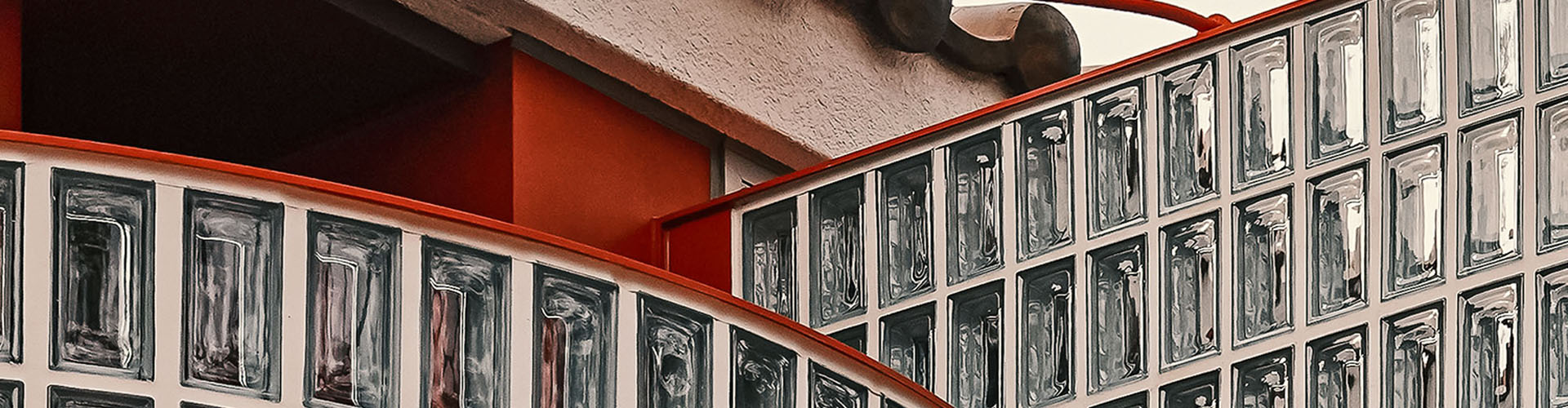
been envisioning that composition, I wouldn’t have made the railing red. The
linear element seems to disrupt the relationship among the masses. A glass
railing wouldn’t have worked either, due to reflections, and brick masonry might
have posed safety concerns. Another solution needs to be found.
Kim: Throughout construction, the brick
edge at the cliff was a constant concern. If even a single brick came loose, it
could cause a serious accident. That’s why we installed the railing slightly
behind the brick line and used brackets to support the existing wall from
within. Along with these linear elements, I used glass blocks, hoping that
their transparency would highlight the artisanal quality of the metalwork while
also evoking a different time period from when the brick house was originally
built. In line with this, I found a reference point in the Maison de Verre
(1932), which also combines glass blocks and intricate metal detailing.
Suh: There are quite a few elements at
play, so I suppose it does feel a bit hectic! (laugh) Even inside, the steel
column used for structural reinforcement could have been hidden within the
wall, but instead, it was deliberately brought out and painted red to become an
architectural element.
Kim: We installed the steel column first,
then removed the existing structural wall, using the new structure as an
expressive feature. And I think I tend to be rather bold when using elements.
(laugh) But isn’t The Petit House, Cheongun also filled with such elements?
Suh: I’d say it’s more about the abundance
of materials than elements.
Kim: Steel, stone, glass blocks, wood,
brick, metal, tiles... there are quite a lot of materials, but also quite a few
elements. Even the façade has the slatted screen in front of the parking area,
the metal wing along the edge, the central mass that folds slightly inward.
What’s interesting about that folded mass is that while it appears to follow
the boundary line of the site, in fact, in reality, the mass is folded at a
gentler angle than the actual lot line.
Suh: In terms of the materials, I’d say the
project critiques the present tendency to finish entire houses in uniform
white. There are so many buildings today – regardless of programme – that
pursue a monolithic aesthetic. That might be appropriate for a museum, but The
Petit House, Cheongun, is a residence. We used materials suited to each space –
the couple’s bedroom, child’s room, hallway, laundry room – while deliberately
pushing the expression a bit further to bring out the underlying concept. If
you look at nighttime photos of the house, the interior and its furniture are
all visible, giving the impression of a rather cluttered space. But isn’t that
reflective of real life? Regarding the folded mass: if the floor plan includes
overly acute angles, it can lead to functional problems.
Kim: If it were me, I would have folded it
even more. (laugh) Following the shape of the site and the road is a
characteristic of the anonymous architecture found in villages, and if that
reference was the starting point for this house, then it could have followed
the bend in the site boundary more closely—or even exaggerated it further. For
me, what matters is to highlight a particular emphasis and provoke curiosity
about the design aims behind it.
Suh: And that’s the difference between you
and me. (laugh)
Park: Both projects share the use of the column
as an architectural element.
Kim: From a purely structural standpoint,
the column in The Petit House, Cheongun isn’t necessary.
Suh: It is possible to remove it, but that
would require the entire design to rely solely on load-bearing walls. In that
case, the wall of the second-floor room would need to extend all the way to the
roof, which would make the living room space feel more confined. It also serves
as a punctuation mark separating the kitchen from the living room. At the time,
I was revising the manuscript of In Search of Lost Korean Houses (2024), and I
imagined a space that would gently embrace a family—like the umbrella-shaped
roof mentioned in the book, based on the theme of House Inspired by an
Umbrella. I intentionally avoided placing the column at the apex of the roof to
express the nature of the reinforced concrete construction method. Unlike a
tent, it is not a structure that requires support at the very top.
Kim: Just as I pulled the column out from
the wall, the column in The Petit House, Cheongun also has a formal aspect.
When aoa architects received the Korean Young Architect Award, Kim Seunghoy
(principal, KYWC Architects), who was a member of the jury at the time, took
note of the approach of inserting another element into a strict plan. I think
he described it as similar to the way Tibetan monks blow away a mandala made of
sand the moment it is completed. In that sense, I believe there’s a satirical
dimension to adding an element to such rigorous form. The frosted finish
too—wasn’t it one of the elements from classical architecture, rustication,
used by Korean house contractors to make their buildings look like wealthy
homes? Now, at a time when no one uses the frosted finish anymore,
reintroducing such a neglected element in an oversized, exaggerated form is, in
my view, deeply satirical.
Suh: Self-destructive, perhaps? I think it becomes meaningful when one creates form and then deliberately dismantles it.
Residence for Mr. P (2025) by KHYarchitects. ©Park Youngtae
Accidental or Emerging Aesthetic
Suh: Many people mistake The Petit House, Cheongun, for a renovation project. That’s because the mismatches between the structure and finish surfaces are plainly exposed, but, in reality, it’s simply due to the very low construction budget.
Park: You’ve often said, from an ethical standpoint, that we shouldn’t demand excessive labour from workers on site in pursuit of higher-quality finishes. But how did you feel when people assumed it was a renovation project?
Suh: I didn’t mind. I actually prefer secondhand clothes or items that look a bit washed out. At some point, I realised I was approaching architecture with a similar aesthetic vision. I’m not sure if it’s because I can’t produce sleek designs, or because I’ve never had the conditions to try, but both in clothing and architecture, brand-new-looking things feel oddly uncomfortable to me.
Kim: I feel the same. I don’t deliberately choose difficult working conditions, and I may not be able to produce polished results, but I do believe there’s meaning in this kind of design. When you work within a tight budget, the friction with reality leaves its mark, and as long as we don’t give up, a new kind of aesthetic can emerge from that.
Suh: It’s like putting on makeup: if you apply foundation to your cheeks, you end up having to do your jawline too, and then your neck—it never ends. If you look closely at the second-floor column of The Petit House, Cheongun, you can see the formwork impressions left as-is, and the column was poured in two separate phases, so the upper part is slightly thinner. The contractor apologised and wanted to apply a finish coat, but it seemed like double-layered straw, and the awkwardness of it started to feel okay. I do like roughness, but I’m constantly asking myself whether I’m just using it as a form of psychological selfjustification for poor working conditions. That’s something I still grapple with.
Kim: There were people who were uncomfortable with your statement in Labyrinths No. 1, when you said, “Let’s stop doing ‘craft’ and just ‘build’ ”. That was perhaps because what you’re talking about isn’t the intentional creation of rough results, it’s the acceptance of what naturally arises in the process.
Suh: Craft can be done during design, not during construction. To be honest, it’s not like there’s no craft at all in The Petit House, Cheongun. For example, the hanok-style sliding door in the second-floor room isn’t a ready-made product. I adjusted the thickness and spacing of the wood slats and the type of hanji paper so that just the right amount of light would filter into the room. But overall, I don’t pursue crafting something to be symbolically displayed. I lean more towards communicating through the way something is made, or presenting the attitude behind the making. Could that be considered spiritual craftsmanship? I’m not sure myself. But this kind of aesthetic actually requires a high degree of design precision. For example, some exposed concrete surfaces retain the expression of the formwork, while the stairwell walls are painted, and the thick metal guardrails and walls include subtly skewed angles—all of which were carefully designed to create deliberate contrast. I put a lot of effort into making sure it conveyed the impression of an ‘intentional’ roughness, and I believe this was achieved.
Park: So, Suh, if you had a sufficient budget, would you refine the finish to a more sophisticated level?
Suh: I wouldn’t pursue sophistication in the conventional sense. In any case, if I get greedy within a limited budget, someone has to make a sacrifice—whether it’s the bricklayer, the metalworker, the client, or the architect. In the case of The Petit House, Cheongun, the builder, the client, and I are all quite satisfied with many aspects. In that sense, I think it was a sound project. That said, I haven’t let go of my self-critical standards. More materials mean more construction processes, which increases costs. What matters most is the overall balance: adding materials for conceptual clarity, and simplifying construction out of ethical consideration. You have to find that meeting point where everyone involved is reasonably satisfied within limited conditions.
Park: Your design seems to have a lot of flexibility, such as using multiple materials, embracing a rough aesthetic, or even allowing room for construction errors. If it had been a more polished design, any deviation would have looked awkward.
Kim: If the design required everything to line up precisely, it wouldn’t have been able to absorb construction errors. You’d have to tear it down and build again.
Suh: Uh... actually, my design was supposed to line up precisely! (laugh)
_
1 This sentence is a quotation and adaptation of a line from Yoon Wonhwa’s ‘Two Bundles — Notes on Cuteness’ (https://yellowpenclub.com/blog/007).